
| Type | Description | Contributor | Date |
|---|---|---|---|
| Post created | Pocketful Team | Oct-18-23 | |
| Update FAQs Formatting | Nisha | Feb-17-25 | |
| Update FAQs Formatting | Nisha | Feb-17-25 | |
| Update FAQs Formatting | Nisha | Feb-17-25 | |
| Update FAQs Formatting | Nisha | Feb-17-25 | |
| Update FAQs Formatting | Nisha | Feb-17-25 |
Read Next![]()
- MCX Trading: What is it? MCX Meaning, Features & More
- Top 10 Intraday Trading Strategies & Tips for Beginners
- How to Use Pivot Points in Intraday Trading?
- What is Intraday Trading?
- Understanding Intraday Trading Timings
- How to Choose Stocks for Intraday the Right Way?
- Blending Candlestick Patterns: How It Works, Benefits & Drawbacks
- Market Order Vs Limit Order: What’s the Difference?
- Silver Futures Trading – Meaning, Benefits and Risks
- What is Crude Oil Trading and How Does it Work?
- Top Algorithmic Trading Strategies of 2025
- What is Paper Gold? – Meaning, Types, & Benefits
- What is Algo Trading?
- What is Tick Trading? Meaning & How Does it Work?
- Rising Window Candlestick Pattern
- Black Candle Pattern
- Piercing Pattern
- High-Wave Candlestick Chart Pattern
- Closing Black Marubozu Candle
- What is the Best Time Frame for Swing Trading?

- Blog
- best options trading chart patterns
Best Options Trading Chart Patterns
|
|
In this blog, we will be discussing the technical trading chart patterns that are used by investors and traders to analyse the price movement of the stock.
To explain,
You must have heard the quote “History repeats itself”. In the same way, when it comes to the stock market, chart readers analyse the history of price movement on technical charts which are made up of certain red and green candlesticks in order to predict the future target price of that particular stock. This is known as technical analysis.
- Now technical analysis comes with various chart patterns which are made up of candlesticks.
- One can use these patterns while trading either in cash or in the options segment.
- These patterns can help someone discover some of the best trading opportunities.
First, we need to understand the meaning of cash and option segments.
Cash Trading

Refers to the buying and selling of financial instruments, such as stocks, bonds, commodities, or currencies, for immediate delivery and settlement.
Options Trading
It is a financial strategy that involves buying and selling options, which are derivative contracts that give the holder the right (but not the obligation) to buy or sell an underlying asset at a specified price (strike price) on or before a specified expiration date. There are two primary types of options: call options and put options.

The next question that would come to your mind would be, how patterns are formed on stock charts? So, the answer to this is, that patterns are made up of candlesticks. A candlestick consists of a rectangular area, known as the “body,” and two “wicks” or “shadows” extending from the top and bottom of the body. Candlesticks can be coloured to represent whether the price of the asset increased or decreased during the time frame. There are basically two types of candlesticks:
Read Also: Ascending Triangle Chart Pattern
Bullish And Bearish Candlesticks
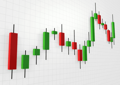
A “bullish” or “up” candlestick is typically white or green and indicates that the closing price is higher than the opening price, signifying a price increase.
A “bearish” or “down” candlestick is typically red or black and indicates that the closing price is lower than the opening price, signifying a price decrease.
Traders often look for specific candlestick patterns, such as “doji,” “hammer,” “engulfing,” and “morning star,” to make trading decisions. These patterns can provide insights for upcoming trend reversals in the market.
After having some basic idea about the technical analysis, it is important to go through some terminologies that are linked with chart patterns.
First and foremost, one must identify the support and the resistance lines in order to understand the basic price movement.
- A resistance level is a price level at which a stock encounters selling interest, preventing it from rising further. It acts as a “ceiling” for the price, where the supply of the stock increases, and buying interest diminishes.
- A support level is a price level at which an asset tends to find buying interest, preventing it from falling further. It’s like a “floor” for the price, where demand for the stock increases, and selling interest diminishes.
Support and resistance are fundamental concepts of technical analysis and play a crucial role in the same.
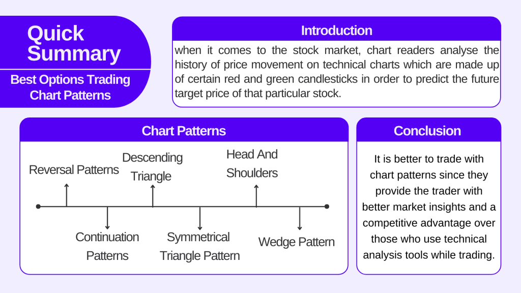
Reversal Patterns
Reversal patterns in technical analysis are chart patterns that suggest a potential change in the direction of an existing price trend. These patterns are valuable for traders and investors seeking to identify points at which an asset’s price may reverse from an uptrend (bullish) to a downtrend (bearish) or vice versa. Reversal patterns can help in making informed decisions about buying or selling a stock.
Read Also: Triple Top Reversal Chart Pattern
Continuation Patterns
Continuation patterns are technical chart patterns that suggest a temporary consolidation or pause in an existing price trend, followed by the continuation of the prior trend. Some of the examples of continuation patterns are listed below
This is the most basic and widely used flag pattern in trading. The pattern above that you are seeing is known as the bullish flag pattern
The pattern begins with a strong and sharp upward price movement called the pole of the flag. Following the flagpole, there is a period of consolidation or sideways price movement. This consolidation takes the form of a rectangular or parallel channel as one can see in the image, sloping downward slightly. This is the flag portion of the pattern. Then comes a bearish flag pattern. The bearish flag pattern is characterized by a flagpole that continues in a consolidation phase. The pattern is considered complete when the price breaks out to the downside, indicating a trend reversal.
Now, our readers must be aware a bit about the target and stop loss. We will also explain through this blog how you can set your estimated target and stop loss while using chart patterns and for this, you need to understand the meaning of target and stop loss. Traders typically place a stop-loss order just below the lower boundary of the flag pattern. This helps protect against potential losses if the price unexpectedly changes its direction.
The price target is usually calculated by measuring the length of the flagpole and adding it to the breakout point.
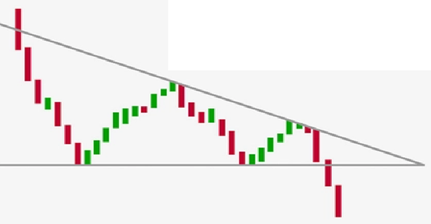
Descending Triangle
This is a continuation pattern with a flat support level and a declining resistance line. The price is expected to break down below the support level, leading to a bearish trend continuation.
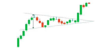
Symmetrical Triangle Pattern
Symmetrical triangles do not have a specific bullish or bearish bias by themselves. The breakout direction provides the bias for the pattern. It is considered a continuation pattern, indicating that the price is likely to continue the existing trend after a period of consolidation.
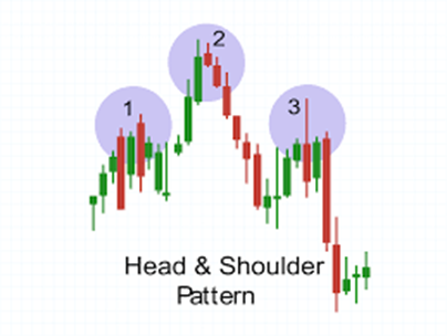
Head And Shoulders
The head and shoulders pattern consists of three peaks. The middle peak (the head) is higher than the two outer peaks (the shoulders). This pattern suggests a potential trend reversal from bullish to bearish.
Wedge Pattern
It is a technical chart pattern used in technical analysis to identify potential trend reversals or trend continuations in the price of a stock, currency pair, or commodity. Wedge patterns are named for their shape, as they resemble a narrowing or converging pattern on a price chart. There are two primary types of wedge patterns: rising wedges and falling wedges.
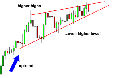
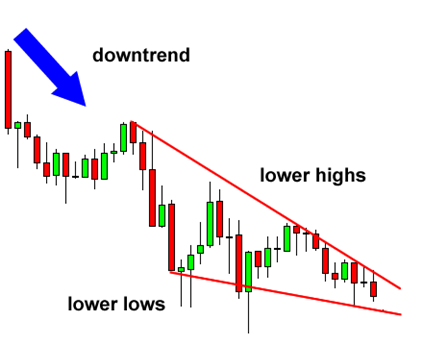
The above figure displays the falling and rising wedge chart patterns respectively.
Read Also: High-Wave Candlestick Chart Pattern
Conclusion
It is better to trade with chart patterns since they provide the trader with better market insights and a competitive advantage over those who use technical analysis tools while trading. Chart patterns represent a comprehensive approach and its analysis can help in a deep understanding of market psychology.
FAQs (Frequently Asked Questions)
What is Options Trading?
Options trading involves buying and selling options, which are derivative contracts that give the holder the right (but not the obligation) to buy or sell an underlying asset.
Is Cash Trading different from Options Trading?
Yes, Cash trading is different from option trading.
What is the resistance level?
A resistance level is a price level at which a stock price faces difficulties in continuing its trend.
What is a candle stick?
A candlestick consists of a rectangular area, known as the “body,” and two “wicks” or “shadows” extending from the top and bottom of the body.
What is a reversal pattern?
Reversal patterns in technical analysis are chart patterns that suggest a change in the direction of an existing price trend.
Disclaimer
The securities, funds, and strategies discussed in this blog are provided for informational purposes only. They do not represent endorsements or recommendations. Investors should conduct their own research and seek professional advice before making any investment decisions.